City Harvest
A SharePoint portal serving 200+ employees daily
Timeline
3 months (Jun – Aug 2025)
Role
Product Designer
Outcome
Redesigned portal for immediate usage, hi-fi prototype and detailed research deck.
Overview
About City Harvest
City Harvest is one of the largest New York nonprofit organization, rescuing and delivering food for New Yorkers experiencing food insecurity.
why a redesign?
In 2021, City Harvest published its organization-wide SharePoint intranet with the hope that resource sharing would be centralized. However, the original design does not support this well.
" height="355.5133556291038px" id="kK5z9uqU1" transform="translate(13.455 0)" width="123.11055542621976px"/></svg>)
Improve navigation
Refine navigation so employees can locate essential information regardless of portal familiarity.
Streamline communication
Improve internal content management experience to reduce inaccurate information.
Increase adoption
Improve content and layout design to increase engagement and confidence in portal exploration.
initial problem discovery
solution highlights
Stakeholder interviews & portal audit
Gauging company culture and working habits
My main research goal was to understand what common experiences did employees have across the organization so maximize the impact of the design recommendations.
From this research, I mapped out the system that is being used under City Harvest:
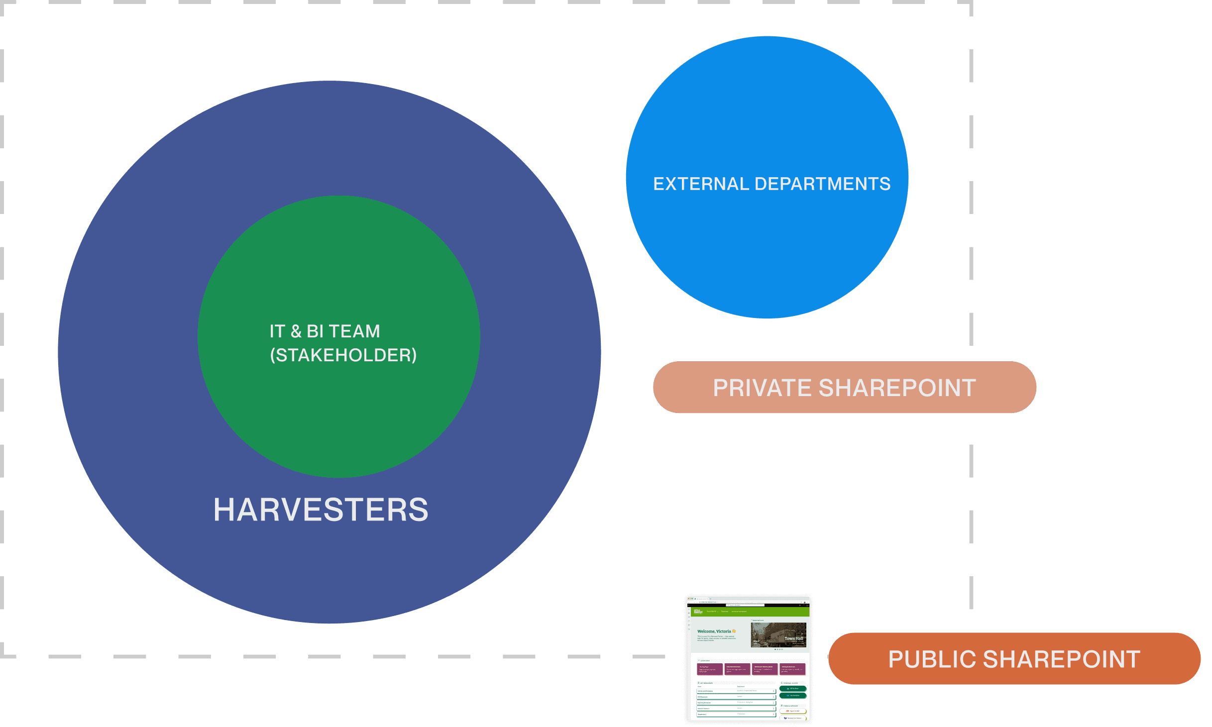
Stakeholder and IOT maps the internal system
I narrowed my research down to these 3 key insights that guided my ideation:
#1 Inconsistent information architecture frustrates employees for non-regular tasks.
#3 Outdated and inaccurate documents across the portal lead to employees completing tasks incorrectly.
I turned them into opportunities that can guide my design process:
rethink information architecture to better accommodate seeking unknown-items?
adapt a standardized template for different department needs?
use design to help cleaning up the portal efficiently?
How might I…
solution IA explorations
Regrouping different types of document
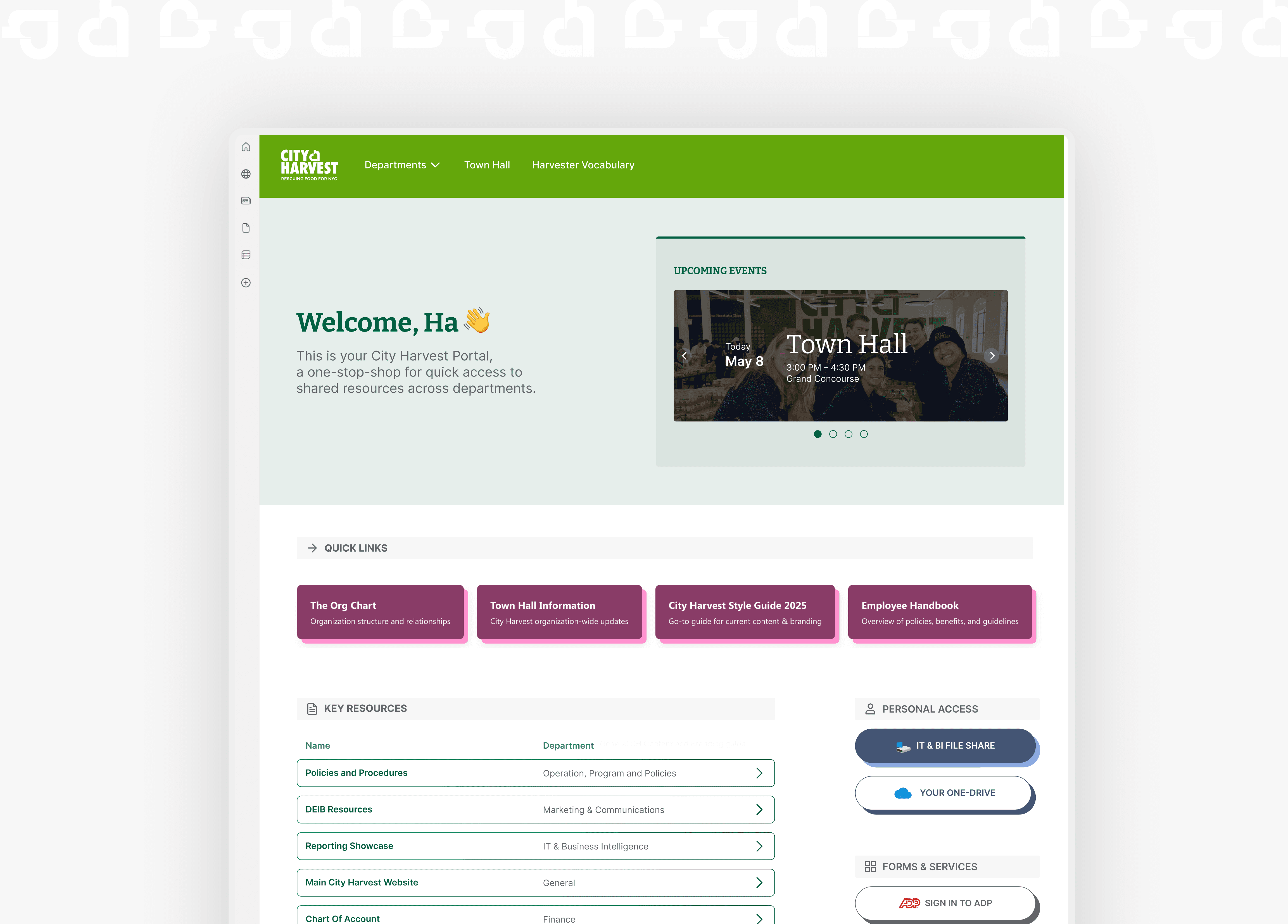
The portal has little intentional organization or information hierarchy. After testing with harvesters, I came up with categories such as "Personal Access" or "Forms & Services" emerged as guidance for better skimming experience.
View The Org Chart
Policies and procedures
Deib resources
Reporting Showcase
Main website
Chart of accounts
IT & BI File Share
your One-Drive
IT & BI File Share
your One-Drive
IT & BI File Share
your One-Drive
your One-Drive
your One-Drive
your One-Drive
your One-Drive
your One-Drive
Quick links
View The Org Chart
Key resources
Policies and procedures
Deib resources
Reporting Showcase
Main website
Chart of accounts
Personal access
IT & BI File Share
your One-Drive
Forms & Services
IT & BI File Share
your One-Drive
Primary screen space reconsideration
I found out that Harvesters access information divergently instead of convergently, meaning that they search for documents directly instead of finding them through departments, so having departments as a dropdown would save more primary screen space for direct access to key resources.
Departments
City harvest
Town Hall
Harvester Vocabulary
City harvest
Departments
Town Hall
Harvester Vocabulary
Final designs
Gentle onboarding with introduction to the concepts of soundscape and constant haptics
Scoping the soundscape with proper location permission
AR mode to live review the sounds with context